
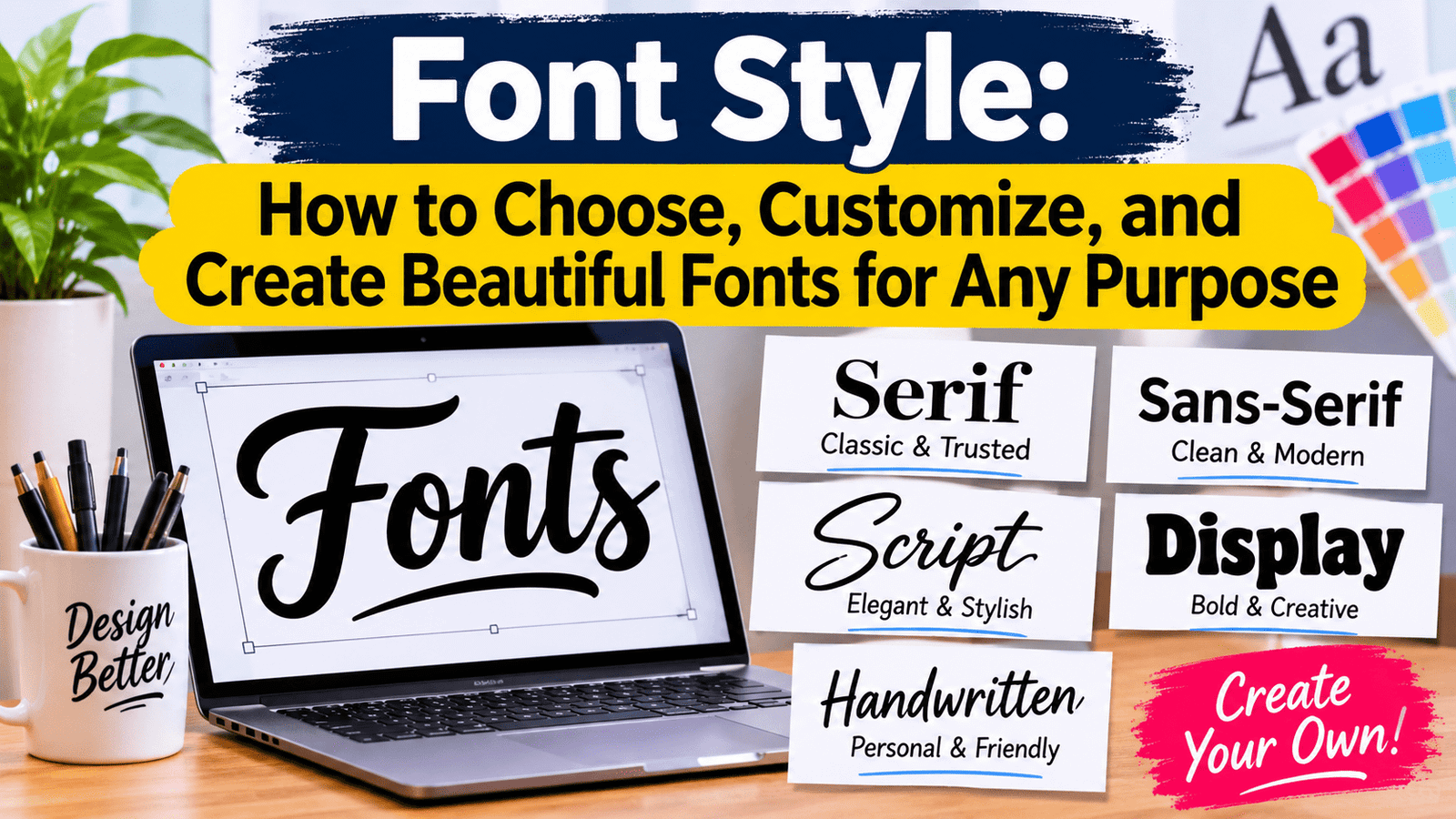
A font style describes the visual appearance of text, including its shape, weight, size, spacing, and decoration. Choosing the right one depends on the purpose of the content, its audience, and where it will appear. Serif, sans serif, script, display, and monospace are common categories, each serving different design needs. The right selection improves readability, strengthens visual identity, and creates a consistent experience across digital and printed materials.
Introduction
Text communicates information, but its appearance influences how people experience that information. Consider the difference between a formal business document, a handwritten invitation, and a technology website. Although all three may contain written words, their typography creates different visual impressions.
This is why selecting suitable lettering is an important part of digital communication and graphic design. A professional website needs readable text, a business presentation requires a clear hierarchy, and a promotional graphic may need something more distinctive to attract attention.
The challenge is not finding the most decorative option. It is finding a design that matches the purpose of the project while remaining comfortable to read. An attractive typeface can become a poor choice when its characters are difficult to recognize or its spacing makes paragraphs uncomfortable.
Understanding typography also helps website owners, students, businesses, and content creators make better decisions. Instead of selecting random designs, they can evaluate available options according to readability, compatibility, appearance, and practical requirements.
What Is Font Style?
Font style refers to the visual characteristics of written characters. These include letter shapes, thickness, proportions, spacing, and decorative details. Together, these characteristics determine how text looks in a document, website, advertisement, or graphic.
In everyday language, people frequently use the words font, typeface, and typography interchangeably. However, they have different meanings in professional design.
A typeface is the overall design of a collection of characters. A font traditionally refers to a particular implementation of that design, including its weight and style. Typography is the broader practice of arranging written text to make information readable and visually effective.
For example, Arial is a typeface, while Arial Bold represents a particular weight within that family. Changing the weight can make a heading more noticeable without introducing an entirely different design.
Understanding this distinction becomes useful when working with design software, website development tools, and professional branding projects.
Why Choosing the Right Typography Matters
Typography affects more than the appearance of a page. It influences how easily readers can locate information, recognize important sections, and understand the overall message.
Imagine visiting a website where every heading, paragraph, and button uses the same size and weight. Finding important information would take additional effort because the page would lack a clear visual structure.
Now consider a website that uses distinct headings, readable paragraphs, and consistent spacing. Visitors can understand the organization of the page more easily.
The same principle applies to printed documents, presentations, advertisements, and business materials.
The main benefits of appropriate typography include:
- Improved readability: Clear characters and suitable spacing make written information easier to follow.
- Better organization: Different text sizes and weights help separate headings from supporting information.
- Brand recognition: Consistent typography contributes to a recognizable visual identity.
- Professional presentation: Appropriate choices make business documents and websites look more organized.
- Accessibility: Readable text, sufficient contrast, and sensible spacing support a more inclusive experience.
These benefits explain why typography should be considered during the planning stage rather than added as an afterthought.
Different Types of Font Styles and Their Uses
Not every typeface is designed for the same purpose. Some prioritize traditional appearance, others focus on simplicity, while decorative options are intended to attract attention.
Understanding the main categories makes it easier to choose an appropriate design.
1. Serif Fonts
Serif typefaces contain small finishing strokes at the ends of certain letterforms. These details give characters a distinctive appearance that is commonly associated with traditional publishing and editorial design.
They are frequently used in books, magazines, newspapers, formal documents, and selected branding projects.
Popular examples include:
- Times New Roman
- Georgia
- Garamond
- Baskerville
Georgia is often used in digital reading environments, while Times New Roman is familiar in academic and formal documents.
Serif designs are not automatically more readable than other categories. Their effectiveness depends on the particular typeface, size, spacing, screen quality, and reading conditions.
2. Sans Serif Fonts
Sans serif typefaces do not have the small finishing strokes found in serif designs. Their appearance is generally clean and straightforward.
They are widely used in websites, applications, dashboards, presentations, and business materials.
Common examples include:
- Arial
- Helvetica
- Roboto
- Open Sans
- Lato
Their simple construction makes them useful for many digital interfaces. However, the best choice still depends on the design and intended audience.
3. Script Fonts
Script typefaces are inspired by handwriting and calligraphy. Some resemble formal handwritten lettering, while others have a relaxed, casual appearance.
They are often used in:
- Wedding invitations
- Greeting cards
- Decorative headings
- Creative branding
- Special event graphics
Script designs can add personality to a project, but they are usually unsuitable for lengthy paragraphs. Their connected or decorative characters may slow down reading, particularly when displayed at small sizes.
4. Display Fonts
Display typefaces are created primarily for visual impact. They may have unusual proportions, distinctive letter shapes, decorative details, or exaggerated character designs.
They are commonly used for posters, logos, promotional graphics, advertising campaigns, and large headings.
Their main purpose is to attract attention rather than support continuous reading.
A practical approach is to use a display typeface for a short heading and combine it with a simpler design for the supporting text.
5. Monospaced Fonts
Monospaced typefaces assign the same horizontal character width to every character. This creates consistent alignment, which is particularly useful in technical environments.
They are commonly used for programming, terminal interfaces, code examples, and technical documentation.
Popular examples include:
- Courier New
- Consolas
- IBM Plex Mono
- Source Code Pro
Their uniform spacing makes code easier to organize, although they are not necessarily the best choice for ordinary website paragraphs.
Font Comparison: Which Type Should You Choose?
The following comparison explains how the main categories differ and where they are most useful.
| Type | Main Characteristics | Suitable Uses |
| Serif | Small finishing strokes | Books, editorial content, formal documents |
| Sans Serif | Clean letter shapes | Websites, applications, presentations |
| Script | Handwriting-inspired appearance | Invitations, decorative graphics |
| Display | Distinctive and expressive | Posters, logos, large headings |
| Monospace | Equal character widths | Coding, technical documentation |
There is no universally best category. A suitable selection depends on the content, audience, layout, and reading environment.
For example, a website publishing lengthy educational articles may benefit from a readable serif or sans serif typeface. A software development tutorial may use a monospace design for code examples while keeping ordinary paragraphs in a separate family.
How to Choose the Best Font for Your Project
Choosing typography becomes easier when you evaluate the project before browsing hundreds of available designs.
Identify the Purpose
Start by deciding what you are creating. A school assignment, company report, website, invitation, and social media advertisement all have different requirements.
A formal report needs consistent formatting and readable paragraphs. A promotional poster may require a more distinctive heading. A website needs typography that works across different screen sizes.
The intended use should guide the selection.
Understand Your Audience
Consider who will read the content and what they expect from it.
For example, visitors to a financial information website generally need a clear reading experience. A creative event page may have more freedom to use expressive typography.
Audience expectations should influence the visual approach without sacrificing accessibility.
Check Character Readability
Some typefaces have unusually shaped letters that may be difficult to distinguish at smaller sizes.
Pay particular attention to characters that look similar, such as lowercase l, uppercase I, and the number 1.
Also consider punctuation, numbers, and special characters if your content includes technical information or financial figures.
Consider the Reading Environment
Text may appear on large monitors, tablets, smartphones, printed pages, or presentation screens.
A design that works well in one environment may not perform equally well in another. Test the selection at the actual size and distance at which readers will view it.
Check Language Support
If your content includes multiple languages, make sure the chosen typeface supports the required characters.
This is particularly important for websites and documents containing Urdu, Arabic, accented Latin characters, or other writing systems.
A typeface without the necessary character coverage may display missing symbols or substitute characters from another design.
Review Licensing Conditions
Before using a typeface commercially, check its licence.
Some fonts permit personal use but require additional permission for commercial projects. Others have different conditions for desktop applications, websites, embedding, or redistribution.
Checking the licence before publishing can prevent avoidable legal and technical problems.
How to Customize Typography
Customization allows users to adjust the appearance of text without changing its meaning.
Most word processors and design applications provide controls for modifying the following properties.
Font Size
Font size determines how large characters appear. Headings usually need more visual prominence than ordinary paragraphs.
For websites, a responsive sizing system helps maintain comfortable reading across different screen sizes.
Font Weight
Weight describes the thickness of the characters.
Common variations include:
- Thin
- Light
- Regular
- Medium
- Semibold
- Bold
- Extra Bold
A heavier weight can make headings more prominent, while regular or medium weights often work well for body text.
Italic Formatting
Italic text has a slanted appearance. It is commonly used to emphasize selected words, distinguish titles, or follow particular editorial conventions.
However, applying italics to large amounts of content can reduce readability.
Letter Spacing
Letter spacing controls the horizontal distance between characters.
Increasing it can create an open appearance, particularly in short uppercase headings. Excessive spacing, however, makes ordinary words harder to recognize.
Line Height
Line height controls the vertical distance between lines of text.
If lines are too close together, paragraphs can appear crowded. If the spacing is excessive, readers may struggle to connect one line with the next.
The appropriate setting depends on the typeface, text size, and available content width.
Text Alignment
Most editing applications provide four common alignment options:
- Left alignment
- Center alignment
- Right alignment
- Justified alignment
Left alignment is a practical choice for many English-language articles. Center alignment is more appropriate for selected headings or short messages, while justified alignment may be useful in certain publication layouts.
Best Tools for Finding and Customizing Fonts
Several tools help users discover typefaces, compare designs, and apply them to different projects.
The most suitable option depends on whether you need website typography, document formatting, or graphic design controls.
Google Fonts
<Entity value=”Google Fonts” category=”software” disambig=”Google’s font discovery and web typography service”/> is a resource for exploring and using typefaces in digital projects.
Its collection includes serif, sans serif, display, handwriting, and other categories. Users can preview available families, compare weights, and find designs that suit their websites.
It is particularly useful for developers and website owners who need web-compatible typography.
Canva
<Entity value=”Canva” category=”software” disambig=”Online graphic design and content creation platform”/> provides tools for creating presentations, posters, invitations, advertisements, and social media graphics.
Users can select text designs, change sizes, adjust colors, and arrange headings without requiring advanced graphic design experience.
It is a practical choice for beginners and small businesses.
Adobe Fonts
<Entity value=”Adobe Fonts” category=”software” disambig=”Font library integrated with Adobe creative applications”/> provides a collection of typefaces for supported creative workflows.
It is useful for designers working on branding, publications, digital graphics, and professional visual projects.
Users should review the applicable licensing and subscription conditions before using selected typefaces.
Microsoft Word
<Entity value=”Microsoft Word” category=”software” disambig=”Word processing application”/> includes built-in tools for adjusting text appearance in reports, letters, assignments, and business documents.
Users can change weights, sizes, alignment, spacing, and heading formats. It is suitable for everyday document preparation.
Figma
<Entity value=”Figma” category=”software” disambig=”Collaborative interface and product design platform”/> provides typography controls for website layouts, mobile interfaces, and digital product designs.
It is particularly useful when designers need to maintain consistent text styles across multiple screens and components.
How to Create a Professional Font Combination
Using one typeface throughout a project can work, but combining two complementary families often creates a more organized visual hierarchy.
The important point is to give each selection a clear purpose.
For example, a website might use:
Headings: A distinctive serif typeface.
Body Text: A readable sans serif typeface.
Code Examples: A monospaced typeface.
This combination separates different content types without making the page look inconsistent.
Another option is to use one typeface family with different weights and sizes. This approach is particularly useful for minimalist websites and business documents.
Before finalizing a combination, check that the selected designs work together in terms of character proportions, spacing, and overall appearance.
Avoid combining multiple decorative typefaces simply because they look interesting individually.
Using Typography for Website Design
Website typography directly affects how visitors interact with content.
Readers should be able to recognize the main heading, understand the page structure, scan important sections, and read paragraphs without unnecessary effort.
A useful website typography system usually includes:
- A clear style for the main page heading.
- Consistent styles for section headings.
- Readable body text.
- Separate formatting for captions and supporting information.
- Consistent button and navigation text.
- Appropriate spacing between paragraphs and sections.
Website owners should also consider performance. Loading too many font files can increase page weight and affect rendering.
Using only the necessary font families and weights can help reduce unnecessary requests. Where appropriate, developers can use modern web font formats and configure sensible fallback fonts.
A fallback system ensures that text remains readable if the preferred typeface cannot load.
Typography and Accessibility
Accessibility should be considered whenever written content is created for a broad audience.
A design may look attractive but still create difficulties for readers if its characters are too small, its contrast is weak, or its spacing is uncomfortable.
Several practical improvements can make content easier to use.
Maintain sufficient contrast: Text should be distinguishable from its background. For standard web content, WCAG 2.2 generally recommends a contrast ratio of at least 4.5:1 for normal-sized text and 3:1 for large text, subject to the applicable exceptions.
Allow text resizing: Readers should be able to increase text size without losing important information or functionality.
Avoid text inside images when possible: Ordinary HTML text is generally easier to resize, select, translate, and interpret with assistive technologies.
Use clear headings: Proper heading structure helps users navigate longer pages.
Do not rely on appearance alone: Important information should not be communicated only through bold formatting or color differences.
These practices make typography more useful to people with different reading preferences and accessibility needs.
Common Mistakes to Avoid When Selecting Typography
Even experienced designers can make choices that reduce the effectiveness of a project.
Understanding common mistakes helps prevent unnecessary design problems.
Using Too Many Font Families
Introducing several unrelated designs can make a website or document feel disorganized.
Choose a limited group of complementary families and establish a consistent system for headings and paragraphs.
Choosing Decorative Designs for Long Articles
Decorative typefaces may work well for short headings, but they can make lengthy paragraphs uncomfortable to read.
Use simpler designs for continuous text.
Ignoring Mobile Screens
A heading that looks balanced on a desktop may occupy too much space on a smartphone.
Test your layout on different screen sizes before publishing.
Using Inconsistent Text Sizes
Randomly changing heading sizes and paragraph formatting makes information harder to navigate.
Create a consistent hierarchy and apply it throughout the project.
Overusing Bold and Italic Formatting
When too much text receives special emphasis, important information becomes less noticeable.
Reserve these treatments for situations where they genuinely improve understanding.
Ignoring Loading Performance
Large collections of unnecessary font files can increase website loading requirements.
Load only the families and weights that your design actually uses.
How Typography Supports Business Branding
A company’s typography contributes to the visual identity that customers encounter across its communication channels.
A business may use a particular typeface in its logo, website headings, advertisements, packaging, and official documents.
Maintaining consistency makes these materials feel connected.
However, choosing typography for branding requires practical consideration. A design should remain recognizable at different sizes and work across digital and printed materials.
For example, a small business creating a logo should check how its lettering looks on a website header, business card, social media profile, and printed advertisement.
It should also consider whether the design is suitable for long-term use rather than selecting something solely because it is currently popular.
The best branding decisions balance distinctiveness, readability, versatility, and licensing requirements.
What Are Variable Fonts?
Variable fonts are a modern font technology that allows multiple design variations to be stored within a single font file.
Traditional font families often require separate files for different weights or widths. A variable font can provide adjustable axes within one file.
Depending on the typeface, these axes may control:
- Weight
- Width
- Slant
- Optical size
- Other custom design characteristics
For web developers, this technology can provide greater flexibility when building responsive typography systems.
However, variable fonts do not automatically improve every website. Their usefulness depends on browser support, file size, implementation, and the requirements of the design.
The Role of AI in Modern Typography
Artificial intelligence is changing how people explore and create visual designs.
Some creative applications can recommend typeface combinations, identify lettering from images, or generate initial design concepts.
These features can help users explore possibilities more quickly, particularly when they do not have extensive design experience.
However, automated suggestions still require human evaluation.
A recommended design may not support every required character, may have unsuitable licensing conditions, or may become difficult to read when used in a particular layout.
AI can support the creative process, but the final decision should consider the actual needs of the project.
Practical Examples: Matching Typography to Different Projects
The easiest way to understand typography choices is to examine common situations.
Example 1: A Business Website
A business website needs a clear hierarchy, readable paragraphs, and consistent navigation.
A practical combination could include a sans serif family for headings and body text, with different weights to distinguish sections.
Example 2: An Academic Assignment
An academic assignment generally requires a familiar, readable typeface and consistent formatting.
The institution’s instructions should take priority because some schools and universities specify particular typefaces, sizes, and spacing requirements.
Example 3: A Social Media Advertisement
A promotional graphic needs to communicate its main message quickly.
A bold display typeface may work for the main heading, while a simpler design can present the supporting details.
Example 4: A Technology Tutorial
A technology article may contain ordinary explanations, headings, and programming examples.
Using a readable text typeface alongside a monospace design for code helps distinguish instructions from technical material.
These examples demonstrate why selecting typography according to context is more effective than using the same design for every situation.
Frequently Asked Questions
1. What is a font style?
It describes the visual appearance of written characters, including their shape, weight, size, and spacing.
2. What are the five main types of fonts?
The five commonly discussed categories are serif, sans serif, script, display, and monospace. Each has different characteristics and uses.
3. Which fonts are suitable for websites?
Arial, Roboto, Open Sans, Lato, and Georgia are examples of commonly used typefaces. The best selection depends on the website’s content, design, and audience.
4. How can I customize text?
You can adjust size, weight, spacing, alignment, and italic formatting using a word processor or graphic design application.
5. What is the difference between serif and sans serif?
Serif typefaces contain small finishing strokes on certain characters, while sans serif designs do not have these decorative strokes.
6. Are Google Fonts free to use?
Google Fonts provides many typefaces under open-source licences. However, users should check the individual licence and its conditions before using a particular family.
7. How many typefaces should a website use?
There is no fixed rule, but one or two complementary families are often sufficient. A third family may be useful for specialized content such as code examples.
Conclusion
Choosing appropriate typography is an important part of creating readable documents, effective websites, professional presentations, and recognizable brands. The decision should be based on the purpose of the project rather than appearance alone.
Understanding the differences between serif, sans serif, script, display, and monospaced designs provides a strong starting point. From there, users can evaluate readability, character support, licensing, compatibility, and performance.
Tools such as Google Fonts, Canva, Adobe Fonts, Microsoft Word, and Figma make it easier to explore and apply different designs. However, successful results still depend on thoughtful selection and consistent implementation.
Ultimately, good typography does not compete with the message. It supports the message, organizes information, and makes the reading experience clearer for the people who matter most: the audience.
