
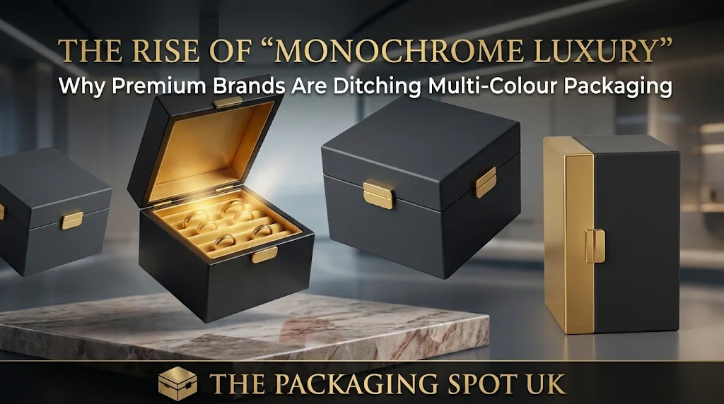
The styles of packaging have become somewhat quiet these days. If we walk into any high-end boutique, we immediately notice that the packaging designs do not have a lot of information ambushed haphazardly on the face of the boxes any more. There was a time when brands used to compete with bright gradients, overwhelming patterns, and four-color artwork. However in modern times many of them now choose one shade and stay committed to it. Single color rigid boxes have become somewhat of a symbol of a confident modern luxury look. This change in itself shows a lot about how customers now read quality instead of falling for fancy artworks.
What Is Monochrome Luxury?
Monochrome means a single color and monochrome luxury is a design that is built with an approach towards restraint.There is one dominant color that dominates the box as a whole, rather than other colors being used to highlight the details and instead texture, finish and shape are used to define the detail of the packaging. For example, a matte black box with a black foil logo and a deep forest green wrap in soft-touch paper or cream stock with a very subtle emboss.
This idea may not sound so new. Fashion houses have been using all black for ages. But the change is that the packaging has finally caught up to this idea: a box in one carefully chosen color looks like something that is made with a purpose. This purpose is exactly what premium shoppers pay their money for.
Why Premium Brands Are Moving Away From Multi-Colour Designs
Less Noise, More Authority
A multicolored box that comes with multicolors makes your eyes work. However a box that has a single color makes your eyes rest. There is a certain way in which customers form their opinions about a brand. If they see that a brand is screaming loud through its packaging that it’s good, they might not believe it. There’s a quiet confidence in a brand that relies on just one prominent color and a minimalist design. It inculcates in the customer’s minds that the company believes strongly in its product quality.
Branding Goals
When a brand owns one shade, this shade becomes a quick shortcut for the customer. You can recognize a certain robin’s-egg blue or a particular burgundy at first sight, even in a room full of colors.The problem with the multicolors is that they split attention between the different shades that they have so there is not a particular one that clearly comes out. Premium single colour rigid boxes provide one single color to the brands around which they can revolve all of their branding in every season.
Better Photography and Social Sharing
The modern world is all about clicking things and posting them on social media. Plain colors in rich formats come out beautifully under almost any lighting when one photographs them. On the other hand boxes that have many colors look overwhelming and rather annoying on a phone screen.
Texture Does the Talking
When you remove extra colors from your box it does not mean in any way whatsoever that you are removing interest from it. It is just the diversion of interest to somewhere else.
Packaging designers tend to rely on tactile details when they add extra depth to monochrome boxes. For instance with the addition of a soft-touch lamination, they can render the box with a velvety feel that compels the customers to make a second touch. This invitation towards touch also comes with the help of embossing and debossing. When it comes to eye captivation, tone-on-tone foil catches light only when the box tilts at a certain angle.
The Structure Matters Just as Much
Colors do get a lot of emphasis when it comes to packaging designs but the actual work force behind a practical box is the structure. If you manage to construct a captivating and reliable structure for your box, a single color with gradients will give it more prominence than a combination of hues. The closing style of your box plays a huge part in this too.
Where The Importance Of Printing Still Matters
The use of a single color should never mean blank. Printed rigid boxes still have a logo to carry. They have a proper pattern and a branding message that may be short but still has to be there. In such a scenario precision becomes even more important. With only one color to play with, any mismatch between the wrap itself and the print comes into prominence immediately. It is better to get Pantone matching and a solid proof before you commit to a larger manufacturing order.
Moving toward monochrome isn’t just a passing trend—it’s a reality check. Visual noise has become a complete turnoff for the customers. In modern times a simple but authoritative packaging weighs a lot more than the one that is shouting for attention with an over-amalgamation of prints and graphics. For packaging that communicates presence, look to Single Colour Rigid Boxes.
